
A few years back, I recall watching a discussion on CNN between a news anchor and two Republican economic strategists. They were making that often repeated argument that “a rising tide raises all ships.” The first I recall hearing this logic was back in the 1980s as a justification for “trickle down economics” or as was often called Reaganomics. The fundamental principle behind this economic stimulus model was that placing more capital in the hands of the wealthy would have a stimulating effect on the economy. The wealthy would spend money in such a way that would drive economic growth. This idea has not lost favor in the last 30 years as the two CNN guests continue to argue its merits. What made this moment stick out in my head was that CNN was showing a graphic during the strategists’ commentary that seemed to completely deny the veracity of their claims.
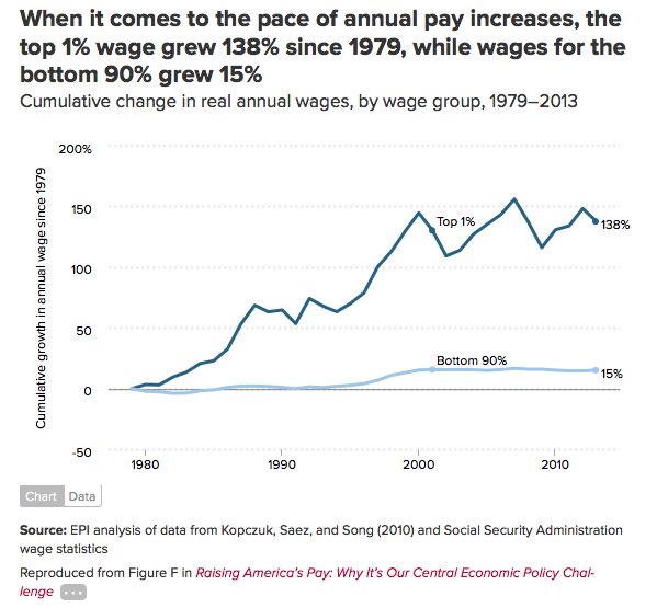
The plot that the guests on CNN were looking at was similar to the plot above, which shows the change in annual wages for the top 1% compared to the bottom 90%. It’s interesting to note that during the early part of the Reagan years, wages declined for the bottom 90% while they still increased for the top earners. Moving from 1980 to 1990, wages remained stagnant for the bottom 90%, while the top 1% saw gains greater than 50%, which translates to a little over a 4% raise each year for ten years. The Clinton years (1992-2000) were obviously better for everyone, but note how steep the slope of the line is for the gains seen by the top 1% during that period. The G. W. Bush years came next and the growth in wages for the bottom 90% stagnated. The top 1% took a hit in the early G. W. Bush years with 9/11 and the commencement of two wars. However, there is money to be made off of fighting wars and the top 1% turns around their wage losses and sees huge gains of nearly 50% before the Great Recession hits in 2008. That represents earning increases of nearly 10% per year between 2003 and 2008. All the while, the wage gains for the bottom 90% stagnated or declined ever so slightly. This is a clear reflection of the redistribution of wealth from the working class to the top 1% of earners. The plot above fails to capture some of the details of what actually happening in the bottom 90%. So, here’s another plot with greater detail:
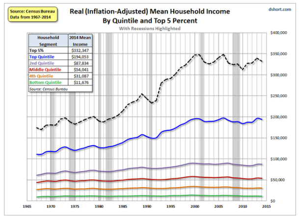
The above plots breaks earners up into quintiles or fifths. The bottom quintile is the lowest 20% of earners. The 4th quintile lies between 20 and 40% of earners. The middle or 3rd quintile corresponds to 40 to 60% of earners. The black dashed line corresponds to the top 5% of earners and note that they are also included in the top 20% or the top quintile of earners. Note that this plot goes farther back in time to 1967. The first aspect of the plot that is worth noting is the timing of the inflections in the income for the top 5% and top 20% of earners. The initial surge comes during the Reagan years following a recession that ended towards the latter part of 1982. At this same time, little or no gains in income were seen for the lower 40 to 60% of earners. Well, one may say that there should be a time lag for the wealth being generated at the top to “trickle down” to the lower wage earners. That is clearly not the case as illustrated by this graph. If you have not been in the top 40% of wage earners over the last 50 years, you have not seen your wages increase at all.
So, back to my strategists discussing plots like this on CNN. How about that rising tide? The data above do not bear out that opinion. In all honesty, the data completely contradicts it! And it doesn’t take someone with a degree in math to read it. Yet, they go on to state that a “rising tide raises all ships.” Well, this may be true for boats in the water, but that metaphor clearly doesn’t apply to economics or the US economy over the last 30-50 years. We’ve clearly run the experiment and found this to be untrue. I would imagine that many workers would say that this is painfully untrue. In fact, the decline in the standard of living/middle class lifestyle for workers is directly related to the frustration we see in the electorate. As for the political strategists, the CNN anchor didn’t challenge them. They didn’t say, this data clearly contradicts what you are saying. “So what is your motivation for continuing to promote a failed economic policy? Why do you continue to hold to an economic premise that has been soundly debunked?”
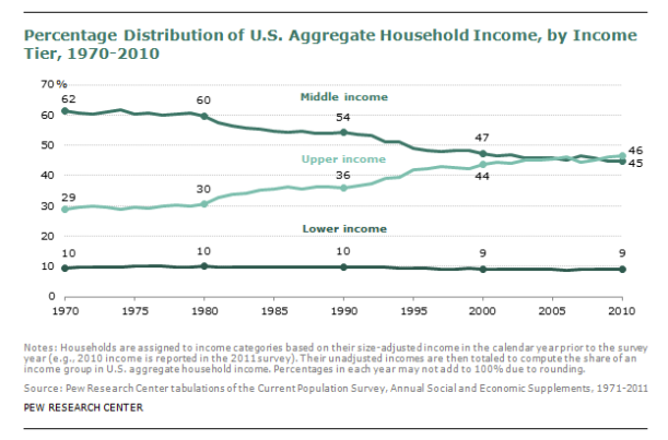
Here’s another plot that should make clear the abysmal failure our current economic policy is for an overwhelming majority of workers in this country. Below is a plot that shows the distribution of household income broken up into upper, middle, and lower income. Between 1970 and 1980, the distribution held pretty constant. In 1980, the drastic shift began so that by 2010, the upper income bracket earns more than the middle income bracket. What this plot fails to capture is just how many more people fall within the middle and lower income brackets than do the upper income bracket. While the number of folks falling into the lower income bracket have likely increased substantially over the last 30 years, their fraction of the total or aggregate income has actually decreased.
The erosion of the American middle class and its standard of living is clearly troubling. However, what compounds my frustration over this point is how the gains in productivity made by the typical worker over the last 40 years have not translated into higher wages. Above I pointed out that wages for the average worker have stagnated. So, workers are producing vastly more, but are making the same or less!
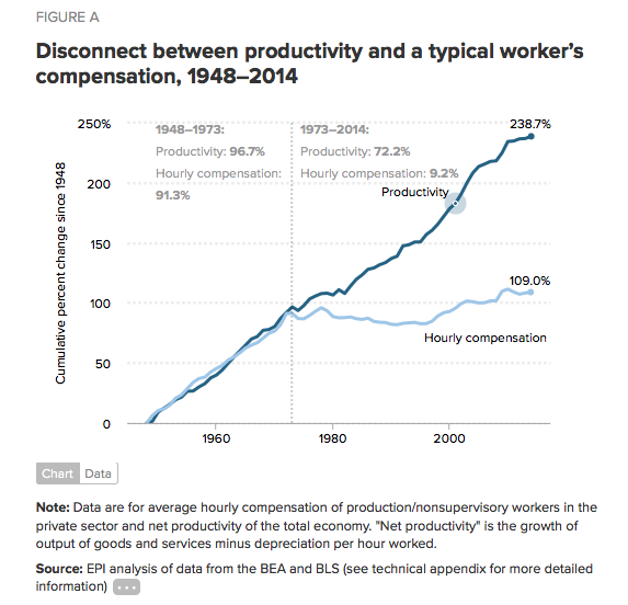
Above is a plot of a typical worker’s productivity along with that worker’s hourly wage over the period of 1943-2014. Beginning just after World War II, note the way pay used to rise with increase in productivity. Between the years, 1943 and 1973, there seems to be a clear correlation. It makes sense. A worker gets paid to make something or provide a service. When the worker produces more or provides more services, this generates more income for the business. More income for the business can be passed on to the worker who is being more productive, making the worker’s compensation a clear reflection of that worker’s productivity. In 1973, that connection between pay and productivity ceased. And, what is really troubling, is that during the Reagan years there was an incredibly steep growth in productivity while wages actually decreased. Yeah, the Reagan presidency, often held up as the gold standard of what a conservative presidency should look like. He is championed by so many white working-class folk. I think this plot alone challenges those supporters’ warm regards for the old Gipper and dashes any notion that “trickle down economics” is viable economic policy. That is, if you want an economic policy that works for everyone.
I want to be clear about what this plot means. Workers are making more product for a business that then makes more money as a result. However, that revenue/profit is not passed on to the majority of its workers. It’s either going to investors or the highly paid executives of the company. If it is being reinvested into the expansion of the company, which in turn hires more workers, wages still do not rise for the company’s employees.
Now, being from West Virginia and growing up in the heart of the coalfields, I feel like labor unions and the right to unionize are, or at least should be, an inalienable right of the working class. After all, our miners were ready to go to war over that right in 1920-21. In a country that believes as we do in the checks and balances on the power of different branches of government, I think it is only natural to believe that corporate interests be balanced by the interests of labor. Unions can effectively represent those interests and balance the power between corporations and workers. As is true of all endeavors that involve people, unions have their challenges, but workers are certainly going to fare better with them than without them. For example, here’s a plot that shows an anti-correlation between union membership and wages for the top 10% of earners.
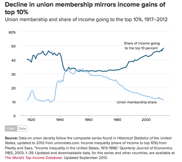
I find this plot really interesting, especially given the recent push for so-called “right to work” legislation that is being passed by many state legislatures. As the unions grow weaker and weaker, the gap between earners at the top and the bottom 90% grows larger. I’m going to guess that the politicians that are pushing this legislation are certainly aware of this trend. Since this is clearly not a good thing for 9 of 10 workers, I am astonished that this agenda item alone does not get many governors and state legislators voted out of office!!!
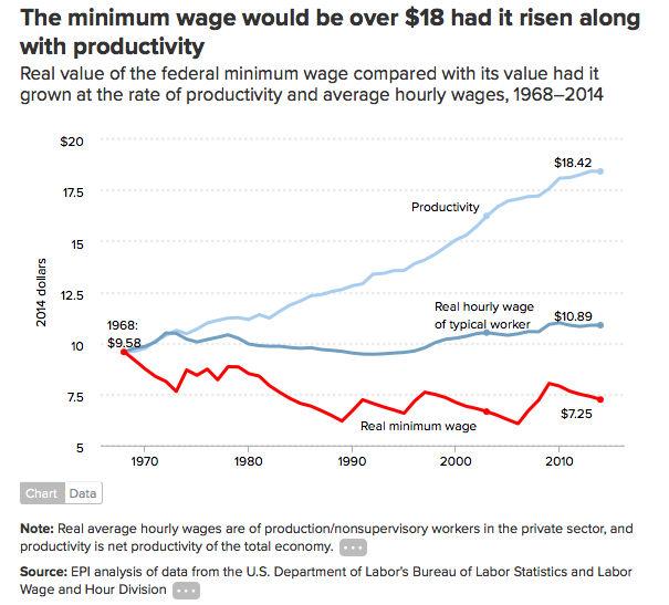
We are currently having a national debate over raising the minimum wage to $15 per hour. For those who have been around for a few decades, this debate should sound familiar. On one side, you have the “sky is going to fall” argument against raising the minimum wage. Businesses will close. Everyone will lose their jobs. On the other side, folks making minimum wage describe how difficult it is to make ends meet on a wage that is not “livable.” Why is it not livable? Well, there is a plot for that too. On the plot below, we can see that the minimum wage was actually higher in 1968, giving earner’s more purchasing power than they have today. Oh, if you factor in productivity gains, as mentioned earlier, to calculate how the minimum would have risen if productivity had remained correlated with wages, the minimum wage would be over $18 today!
What does all of this mean? Why am I interested in putting all of this data in one place? Well, in my mind, it explains a lot about the current current political climate. People are upset and all of this data says “Rightly so!!” My fear is, that without the right data, people are going to misdirect that anger and instead of supporting an economic policy that will be fairer than “trickle down” or “supply side” or “job creator” economics, they will vote for the candidates that will continue to support the current system that continues to redistribute wealth from the middle class and working poor to the top 1%. Yeah, wealth redistribution. That’s what has been happening since the Reagan years. Wealth has been redirected from the middle class into the hands of the highest of wage earners. Nobody calls it that because wealth distribution suggests taking money from rich people and giving it to poor working class folk. It’s the equivalent of a four-letter word when spoken by Republican strategists and politicians. Yet, they have been engineering a massive wealth redistribution project for over 30 years that has been incredibly successful.

What can we do? Support a progressive tax structure that requires the highest earners to pay a reasonable tax rate and stop privileging earning from capital gains over earnings produced by actual labor by taxing capital gains at a significantly lower rate. Recognize the importance of estate taxes that prevent generational wealth and the formation of an aristocracy similar to that seen during the Gilded Age. Support a raise in the minimum wage and work to restore the dignity of all work. Finally, stop taking our political leaders at their word. Just because you think what they say may sound good, in many cases, there is data that you can use check their claims against. Oh, and one more last point, Reagan was a horrible president for working-class folk in this country. We are still reaping the benefits of his presidency, one that claimed to “Make America Great Again.”
